Kogumaza - Nottm Trent University 29.05.11 from neil johnson on Vimeo.
Tuesday, June 21, 2011
EBay Frustration
I'm selling a cheap and cheerful guitar on EBay at the moment to raise some funds. Here's a genuine message exchange I've just had:
Hi...
Funny how time shows how the now legendary Japanese consistency of quality is really a very recent phenomenon.
I too had experience of the Sumbro brand in the early seventies (mainly SG copies) and while I have seen some nice examples subsequently, the dozen, or so I handled were assembled using what were without doubt the cheapest, nastiest, hardware fitted to any guitar at the time... The chrome on the pickup covers flamed off as they left he shop, the machine heads rattled when unstrung and the plywood bodies were as lively as concrete posts.
- b**dicus27
Dear b**dicus27,
Erm... thanks...
I would suggest not bidding then and perhaps making better use of your time? Write a novel perhaps? Break the elusive code in the Taman Shud case from Australia in the 1940s (Google it: well worth a read)?
Or better still, learn some manners maybe? Let me know if you ever put your house on the market and I'll pop over and point out faults in other people's guttering I have seen.
Regards,
Chris
Dear chris_summerlin,
Firstly, youll have to forgive the grammer and spelling, as this device has its own, strange predictive text system.
If you'd bothered to read my last message properly, you will see that I was remarking on the inconsistency regarding the quality of early 1970s Japanese manufacturing, while making it absolutely clear that the Sumbro guitars I came across after that dismally poor batch of a dozen, or so I had to sell were not of such a poor standard.
if youre going to spend your time exalting the quality of a marque in order to raise its standing in the eyes of those who know no better and may be about to give you money, and you actually care one jot about courtesy and manners, you should be prepared to be corrected and accept an equal amount of valid criticism when you perceive it instead of throwing a tantrum.
As for what I do with my time.... Not that it has anything to do with you...... If you believe it's wrong for me to point it out when someone makes blanket statements without giving a balanced view, then your opinion of what is and what isn't good manners requires serious adjustment.
My state of health means that I do indeed have too much time on my hands. I probably do spend too much time reading some of the drivel people write in heir listings and if you think that an Ill considered tirade from someone not even capable of reading a statement properly is likely to bother me more than an untreatable illness, your intellectual faculties are dismally lacking.
The only reason I took the time to read your listing is that I would have liked to have another 70s Gibson copy to go with my others, but I can honestly say that after your arrogant response to my previous message, I wouldn't buy a Gold plated Sheraton off you if it was advertised for free.
Don't bother replying, as I will delete any further communication from you without even reading it.
- b**dicus27
Dear b**dicus27,
Look pal - you messaged *me*. I answered. The listing says clearly what the pros and cons of the instrument are. Check my other sales of guitars - all positive feedback, all happy people, all fair prices. Hence this is 90 quid start, no reserve as opposed to the 250 quid or more that Sumbros, Mayas, CSLs, Kimbaras etc etc often get.
I *did* read your message carefully, it was speculating on the variable quality of these instruments. No question about the item, just a statement that somehow implies that I am being misleading in my description so excuse me if I failed to pick up on your interest. Fact is, I don't care about the variable quality of the instruments, I care about the quality of *this* particular instrument because that's the one I am selling. I'm not selling all of them ever made. I have described the quality more than adequately in the listing as opposed to "exalting" it. Warts and all with pictures to show them.
What you do with your time has everything to do with me if you spend it writing to me. Sorry to hear about your health but if you think that gives you carte blanche to be snooty about a listing for a 90 quid guitar, then I'd still recommend writing that novel I suggested - we all need to spend our time more wisely on this planet. Unfortunately, the internet is a handy distraction to that.
Sincere best wishes,
Chris
Auction is here if you want to critique my description too...
http://cgi.ebay.co.uk/ws/eBayISAPI.dll?ViewItem&item=290577836668&ssPageName=STRK:MESELX:IT
Hi...
Funny how time shows how the now legendary Japanese consistency of quality is really a very recent phenomenon.
I too had experience of the Sumbro brand in the early seventies (mainly SG copies) and while I have seen some nice examples subsequently, the dozen, or so I handled were assembled using what were without doubt the cheapest, nastiest, hardware fitted to any guitar at the time... The chrome on the pickup covers flamed off as they left he shop, the machine heads rattled when unstrung and the plywood bodies were as lively as concrete posts.
- b**dicus27
Dear b**dicus27,
Erm... thanks...
I would suggest not bidding then and perhaps making better use of your time? Write a novel perhaps? Break the elusive code in the Taman Shud case from Australia in the 1940s (Google it: well worth a read)?
Or better still, learn some manners maybe? Let me know if you ever put your house on the market and I'll pop over and point out faults in other people's guttering I have seen.
Regards,
Chris
Dear chris_summerlin,
Firstly, youll have to forgive the grammer and spelling, as this device has its own, strange predictive text system.
If you'd bothered to read my last message properly, you will see that I was remarking on the inconsistency regarding the quality of early 1970s Japanese manufacturing, while making it absolutely clear that the Sumbro guitars I came across after that dismally poor batch of a dozen, or so I had to sell were not of such a poor standard.
if youre going to spend your time exalting the quality of a marque in order to raise its standing in the eyes of those who know no better and may be about to give you money, and you actually care one jot about courtesy and manners, you should be prepared to be corrected and accept an equal amount of valid criticism when you perceive it instead of throwing a tantrum.
As for what I do with my time.... Not that it has anything to do with you...... If you believe it's wrong for me to point it out when someone makes blanket statements without giving a balanced view, then your opinion of what is and what isn't good manners requires serious adjustment.
My state of health means that I do indeed have too much time on my hands. I probably do spend too much time reading some of the drivel people write in heir listings and if you think that an Ill considered tirade from someone not even capable of reading a statement properly is likely to bother me more than an untreatable illness, your intellectual faculties are dismally lacking.
The only reason I took the time to read your listing is that I would have liked to have another 70s Gibson copy to go with my others, but I can honestly say that after your arrogant response to my previous message, I wouldn't buy a Gold plated Sheraton off you if it was advertised for free.
Don't bother replying, as I will delete any further communication from you without even reading it.
- b**dicus27
Dear b**dicus27,
Look pal - you messaged *me*. I answered. The listing says clearly what the pros and cons of the instrument are. Check my other sales of guitars - all positive feedback, all happy people, all fair prices. Hence this is 90 quid start, no reserve as opposed to the 250 quid or more that Sumbros, Mayas, CSLs, Kimbaras etc etc often get.
I *did* read your message carefully, it was speculating on the variable quality of these instruments. No question about the item, just a statement that somehow implies that I am being misleading in my description so excuse me if I failed to pick up on your interest. Fact is, I don't care about the variable quality of the instruments, I care about the quality of *this* particular instrument because that's the one I am selling. I'm not selling all of them ever made. I have described the quality more than adequately in the listing as opposed to "exalting" it. Warts and all with pictures to show them.
What you do with your time has everything to do with me if you spend it writing to me. Sorry to hear about your health but if you think that gives you carte blanche to be snooty about a listing for a 90 quid guitar, then I'd still recommend writing that novel I suggested - we all need to spend our time more wisely on this planet. Unfortunately, the internet is a handy distraction to that.
Sincere best wishes,
Chris
Auction is here if you want to critique my description too...
http://cgi.ebay.co.uk/ws/eBayISAPI.dll?ViewItem&item=290577836668&ssPageName=STRK:MESELX:IT
Saturday, May 07, 2011
Zomes & Kogumaza European Tour May 2011

ZOMES & KOGUMAZA in Europe, May 2011
WEDNESDAY MAY 11 PARIS ESPACE B
THURSDAY MAY 12 BORDEAUX LE NOVO LOCALE
FRIDAY MAY 13 ZARAGOZA ARREBATO
SATURDAY MAY 14 MADRID ROCK & POP
SUNDAY MAY 15 BARCELONA MOOG
MONDAY MAY 16 TBC
TUESDAY MAY 17 BOLOGNA LAZZARETTO
WEDNESDAY MAY 18 VIENNA RHIZ
THURSDAY MAY 19 PRAGUE A STUDIO RUBIN also w/DANIEL HIGGS
FRIDAY MAY 20 LEIPZIG KAFIC
SATURDAY MAY 21 ANTWERP SCHELD'APEN
SUNDAY MAY 22 LONDON FIRE STATION COMMUNITY NURSERY
CLICK HERE TO LISTEN TO THE LP "EARTH GRIDS" BY ZOMES.
(You should, it's fantastic)
Come along, say hi.
(Tour poster by David Hand)
Kogumaza LP Out Today

Available now on clear vinyl and download (download free with the vinyl or purchasable separately).
http://lowpoint.bandcamp.com/album/kogumaza
Wednesday, May 04, 2011
Friday, April 15, 2011
"Lawsuit" Gibson SG For Sale

Just got a bill for finally repairing my Fender Twin Reverb after years of gigging and tour-rentals to Erase Errata and Gang Gang Dance and a million more. It's hefty so I have to clear out some stuff... I'm selling my spare "lawsuit" SG (right). I bought it as a back-up for my Antoria SG (left) not long ago. It uses the same body and neck type but differs in the hardware. It has a fixed bridge and tailpiece and the bridge itself is a level bar type not a Tun-o-matic copy. It intonates very nicely though. The strap peg on the back is on the neck heel as opposed to the body. The tuners have been swapped out for 6-a-side ones which means the top 3 wind the wrong way. If I can find the set off the Antoria (I swapped them for some Grovers I had lying around) then I'll include them in the sale if you want to put it back to stock. The pickups appear to have both been changed. The neck looks like a normal period-correct Super 70 type but the pickguard has been cut along the top edge suggesting it's been installed later. The bridge one is a mystery. Looks a bit like a Univox but it isn't. It's dead as a dodo though. A quick glance under the pickguard suggests a home installation by someone about as skilled as I am. I suspect this is what confined this guitar to the cupboard of the previous owner. In any case I am confident a re-wire would get this mysterious pickup firing again.
Other stuff: there are stress cracks at the neck heel like just about every other guitar of this era with a bolt-on neck. Nothing to sweat about. It's missing about an inch of binding on the treble side of the neck too. Another common problem. At least the inlays on the fretboard haven't dropped out. So there you go. It's cheap so msg me if you want it.
More pics: http://www.flickr.com/photos/sumlin/
Sunday, April 10, 2011
Remix
Just did this remix for friends and pub companions Medium Death Kick. The original song was a perfectly-proportioned sketch-like nugget on their album but it seemed ripe for expanding and messing with. Ended up being a bit more Kevin Shields than expected but I hope that's a positive. All done very lo-tech as well, just on the Way-Out Is The Way Out studio gear which means lining up the vocals and manually pressing play when you hope they should come in. Plenty of trial and error, like it should be. Andy from the band made this awesome montage-style video for it. Love the bit with the dog and the body on the beach.
Anyway - WILL REMIX FOR RED STRIPE AND/OR MONSTER MUNCH. Hit me up...
Friday, April 08, 2011
Epiphone ET270 For Sale
 My esteemed bandmate Philip John Welding is selling this piece of total rock history. Get in early and beat the Hard Rock Cafe. It's a 1970s Epiphone ET270 as used by Kurt Cobain (not this one), Justin Trosper (not this one), LCD Soundsystem (the bass version), Trans Am (this exact guitar) and erm...Lords. Some nice touches like the E pickguard (which Phil's other 270 doesn't have) and a pearl inlay logo (ditto). The pickup surrounds have crumbled to dust and it's got chips and dings as well as vintage replacement Schaller tuners but this is a bad-ass guitar for sure. He's also selling a 1970s Maya fretless P-bass with changed hardware and perhaps a changed body as it's a thick, heavy, possibly mahogany lump of wood that makes this thing sound enormous. Message me if you're interested in either. If you're near Nottingham feel free to suggest trying them out.
Wedding Invite
 Another wedding invite, this time for one of my best and oldest friends who finally found a lady willing to put up with him and for that we should all feel suitably warmed. I normally run a mile from the words "soft", "pencil" and "portrait" but I'm willing to give anything a go when it's for someone who has helped me out of many tight spots, usually involving pouring me into the back seat of a car and getting me home from some gig or another in our teens. I guess I lucked out on this one as it turned out very nicely, if I say so myself. I suspect the wedding party concerned might not end as softly or as tastefully...
Posters For Daniel Higgs Tour


Monday, March 21, 2011
New Red-Eyed & Blue Poster

Another one for The Brute Chorus. This one absolutely broke my brain (not entirely the fault of the poster, more the timing of it's desired completion date!) but luckily it all turned out nice in the end. Some Gris-Gris style Day Of The Dead witchdoctor shit. In yer breakfast...
Hhymn - "In The Depths" CD Artwork

Pete Fletcher at First Love Studios really saved our collective hides recently with some very generous studio time to complete the Kogumaza LP. Nice to return the favour and be asked to put together this sleeve for the first release on Pete's label Denizen Recordings by Nottingham's own Hhymn.
They supplied the wonderful Ian Chatburn underwater photos and some design direction. Maybe my hungover brain was operating on half power but it was a real struggle to find space and colours to make text work well over such detailed and high-contrast images without ruining the images or making the text illegible. I thought about resorting to boxes or worse still, shrinking the pictures and putting the text underneath. Some Monster Munch and a lie-down later and I went mental with the crop tool and cut the images to quite extreme levels in an attempt to place the divers contained within them on the periphery of the image, making it somehow a little spooky and taking the emphasis away from the human involvement in the images (and isn't that always the best music too: made by humans but with as little trace of their grubby paws as possible, like something in nature just laid it right?).
Some blue and red tints later and I'm very happy with the results. I think Peter Saville was on my mind or at least a low-rent version of him.
Out soon. In the meantime watch Hhymn's video here: http://vimeo.com/21108423 and marvel at the lovely blue Fender Jaguar contained within...
Here's some more images of the sleeve, click them to be magically transported to a world where they're bigger.


Tuesday, March 15, 2011
Kogumaza LP Artwork


Forthcoming on Low Point on clear vinyl. Katharine Eira Brown took the cover image (of the coast at Aberdyfi) on Kodachrome slide film and I added the minimal graphic elements.
Sunday, March 13, 2011
Recent Artwork


2 new pieces of work from the last month. At the top is a significantly scaled-down version of a one-off piece done as a commission by my friends Matt and Kerry who wanted something for their living room wall and liked what I'd done for the band The Slow Life. The actual piece is framed and measures something like 3 feet across.
Below that is a gig-poster-as-wedding-invitation for Anna Storakers and Per Winroth. Anna has commissioned me to do lots of gig posters in the past and she really wanted something for her wedding that was funny. And has Basset Grifon dogs on it...
Kogumaza LP
Kogumaza LP preview. Out May 9 2011 on Low Point on clear vinyl and download. You can hear a full track over at the Low Point Sound Cloud Page.
We open for Deerhunter in Leeds on March 29 (get there early). And then you can buy a copy of the LP early at shows in Nottingham at Chameleon on May 5 (with Ex Easter Island Head and Apalusa) and Bristol at the Cube Cinema on May 7 (with Nathan Bell and more).
We're then off to mainland Europe with Zomes from May 11 to the 22, more details to follow.
Wednesday, January 26, 2011
Manic St Preachers
Something has always bothered me and I am hoping a fan of the band can help clarify things. Is it Manic Street Preachers as in "Preachers on a road called Manic Street"? Or is it Manic Street Preachers as in "Street-preachers who are manic"? Is it Manic Street Preachers? Or Manic Street Preachers?
Sunday, January 23, 2011
Scans Of Bands
Throughout the 1990s and early 00s I never went anywhere without my trusty Olympus Super Zoom AZ300. I have boxes and boxes of photos of gigs, most of them pretty awful. Ignoring this, I decided to scan them a few weeks ago and chuck them up on Flickr. They are here: http://www.flickr.com/photos/sumlin/sets/72157625712202359/with/5360811013/ And here are some of my favourites:  Fugazi; Nottingham Marcus Garvey Ballroom
  Bob Tilton; Nottingham Dubble Bubble
  Deerhoof; Nottingham Maze
  Fugazi; Nottingham Rock City
  Godspeed You! Black Emperor; Manchester Amigo's Cafe (first ever European show)
  Jamie from Scarfo (now from The Kills) enjoys Ligament's last gig (it wasn't); London Upstairs At The Garage
  Mogwai secret show opening for Ligament; London Upstairs At The Garage
  Shellac; Camber Sands
  Sweep The Leg Johnny; Birmingham Jug Of Ale
  Sonic Youth; Shepherd's Bush Empire
  The Make-Up; Notting Hill Arts Cafe
  Trail Of Dead; Nottingham Social
Fugazi; Nottingham Marcus Garvey Ballroom Bob Tilton; Nottingham Dubble Bubble Deerhoof; Nottingham Maze Fugazi; Nottingham Rock City Godspeed You! Black Emperor; Manchester Amigo's Cafe (first ever European show) Jamie from Scarfo (now from The Kills) enjoys Ligament's last gig (it wasn't); London Upstairs At The Garage Mogwai secret show opening for Ligament; London Upstairs At The Garage Shellac; Camber Sands Sweep The Leg Johnny; Birmingham Jug Of Ale Sonic Youth; Shepherd's Bush Empire The Make-Up; Notting Hill Arts Cafe Trail Of Dead; Nottingham Social
Wedding Invitation Design

My friends Jenny & Kate wanted a humorous and memorable Save The Date card to send out prior to the invitations for their wedding.
A little bit of jiggery-pokery with a playing card and some penmanship later and here we are.
Printed on glossy card at playing card size too.
Nottingham Critical Pedagogy Logo

Logo design for the Nottingham Critical Pedagogy student group, commissioned by David Bell and completed at the end of last year. We spoke a little about trying to convey an idea of there being power in critical thinking and David expressed that he wanted something lively to offset what is seemingly a very dry subject matter. From this we somehow got onto emblem design from the Soviet space programme and we ended up with this bear and pencil design. They have it in a variety of different configurations to use in any application they like, including in a circle so they can get it embroidered onto their space suits when they get them. Which they should.
Wednesday, January 12, 2011
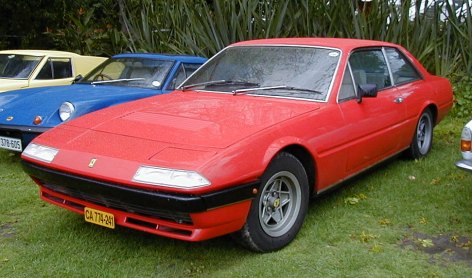
COTD 3: Ferrari 365 GT4 2+2 / 400 / 412

It had to happen. I picked 2 esoteric choices for the first Car of the Day entries and so now I have to pick a Ferrari.
Sorry.
I’ve been nuts about Italian cars since I was a kid. Blame my parents. Blame Magnum PI or Miami Vice. Blame Beverley Hills Cop II. Blame Cannonball Run (One and Two, but mainly One).
However: in keeping with the spirit of these vehicular outbursts, I’m going to select one of the most unpopular cars to ever leave the Maranello factory gates – the 365 GT4 2+2/400/412 series.
Even at the height of the car boom of the late 1980s, these front-engined four seaters were tricky to shift. And this was at a time that people were paying over list-price for anything with a prancing horse on the bonnet and it was possible to sell a brand new car for a huge profit just by taking delivery of it.
You can trace the disinterest in the series through the history of 2+2s that the company have made (2+2 meaning “2-in-the-front/2-in-the-back”, or “not quite a 4-seater really, unless you’re really short or you don’t have legs”).
The wonderful 250GTE was the first mass-production car that Ferrari produced. An elegant but muscular saloon powered by the same V12 as the more sporty and desirable models but able to take the kids and the luggage to the summer house (at exceptional speed). It had the poise of a street rod but the simple and beautiful design details of it’s more valuable (now) siblings like the 250 GT SWB. Crucially, it’s a subtle car.
It’s easily in my Top 10 Ferraris, maybe even my Top 5. As someone who can name over a thousand minor variations in the marque and who wrote several thousand words (for no real reason) on the great “0846 debate”, this is high praise indeed. I really think about these things. I really am that much of a loser.
However, take a quick look online and you’ll see the majority of these lovely cars have been scrapped, with the mechanical aspects cruelly stripped out and used to build either replicas of more valuable models like the GTO or kept as spares for the real thing by wealthy vintage car racers. Recently an absolutely perfect condition GTE showed up on EBay minus its engine after it was bought at auction solely for items which were to be used as spares for a more financially valuable car. At least someone has the chance to salvage something from this one, elsewhere GTE body shells lie in coachbuilders’ backyards acting as accidental flowerbeds:

It’s heart breaking.
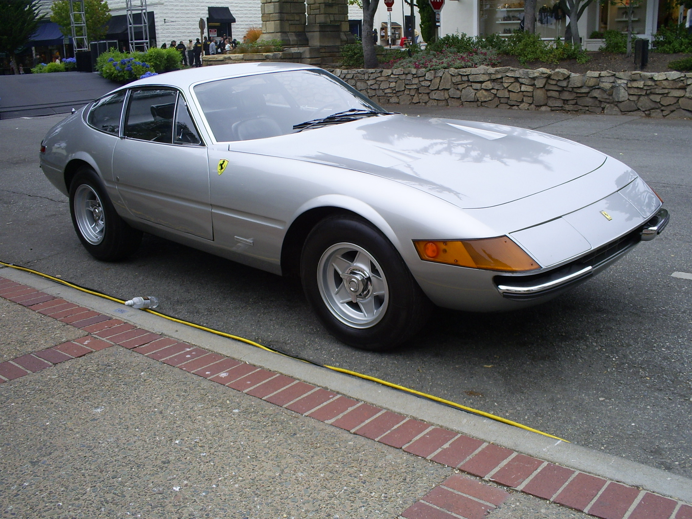
The 400 series (I’ll call it that for shorthand) has a similar story. Brought out in the early 1970s as a replacement for the 365 “Queen Mary” it roughly echoes the equivalent changes to Ferrari design of the period in that the curves and open lights of the older models were replaced with slightly more angular styling and sleeker, pop-up lights (see the 275 GTB to Daytona, or the Dino to 308GTB later on).
Today, it’s possible to pick one of these up for less than a Nissan Micra but the hideous costs of maintaining a 30-something year old, V12 engined Italian car mean few people are wealthy (or brave) enough to take the risk. Specialist breakers’ yards (such as http://www.eurospares.co.uk/) are full of these things. In fact, take a look at this widely circulated photo of the recovered wreckage from the tragic Lockerbie bombing:

That’s right; in the foreground is the remains of a Ferrari 400.
I can’t remember the last time I saw one of these things on the road, moving.
That is a pity, as that’s where they are in their element. Modern cars are designed with the photographic image in mind. Most people will see their first glimpse of a new supercar in print, not in the flesh. So you end up with cars like the Ferrari F50: it looks like a bazooka battleship on a glossy page but it just sits wrong on the road, ending up looking like the outpourings of a just-pubescent male in the back of his maths book.
The 70s period for design house Pininfarina acts as a textbook example of how to design a car that looks great on the road.

Recently I saw a first series Ferrari Mondial (a car similarly maligned in Ferrari aficionado circles) on the road and it looked fabulous. Squat, hunched forward, clearly defined and unfussy in detail compared to modern Ferraris. The 400 perfectly illustrates this line of thinking, though you can see why it isn’t universally considered a design classic.
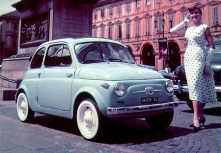
In photos it’s hard to determine its “face”. Its curious bi-level nose is the culprit – making it hard to define the crucial eyes and mouth recognition that makes a car appealing to us weird human types. That face recognition is why we see the Morgan Aeromax as cross-eyed, the Citroen DS as “Shark-like” and the Fiat 500 as unthreatening. The 400 is just confusing – from standing eye-level at least. It looks like it should solely have pop ups like a Bitter Coupe or BMW 8 Series; or a more defined and stepped up nose like the latter Pininfarina concept car the Ferrari Pinin, or other equally luscious Farina creations like the Lancia Gamma Coupe or the Fiat 130 Coupe. The Aston Martin Lagonda suffers from the same styling problem (among many others – though it too looks incredible on the road). Plus, the need for 4 seats makes it all look a little stretched and poorly balanced. In photos it’s only the rear ¾ view that appeals.

Put it on the road next to the cars of the time (or now) though or crouch down and look at one from a seated perspective and it looks fantastic. I remember going to the coast in Norfolk with my parents and seeing a black 400GT heading towards us on the other side of the road with its lights up. It stuck in my mind like a photo. The car’s width and poise make it look perfectly aggressive whilst still being strangely subtle (for an enormous V12 supercar). It is the absolute antithesis of the F50 and I am willing to stake money that it will age significantly better than either the current 599 or its direct descendant the 612 Scaglietti, both of which are too big, too ostentatious and too sloppy looking to really work. The 612 in particular looks like the early stages of an omelette. The angular, sweeping 400 is confident and bold in comparison and represents the perfect gentleman (or woman) express.
It’s also the only Ferrari I have ever been in. My late Granddad called me up to say I should pay him a visit with my Dad when I was about 13 or so. He took me to see a mechanic neighbour of his who had borrowed a late 70s 400GT from his work to offer rides to kids at a garden fete. I think it was registered APG 58T. It was £55,000 back then. You could get one for a tenth of that now. It was in a perfectly 70s metallic silver blue/green with tan leather inside. I went for a ride in it and it felt like it was taking off on the road between Northborough and Peakirk. I remember looking at the speedo and it saying 130 mph. Judging from Ferrari’s optimistic speedos it was probably closer to 100 but that’s still plenty on an A road in a car that weighs the same as a bungalow. It was a carburetted model too so the noise was deafening – even though this was supposed to be a more civilized Ferrari. It left quite a mark on me. The registration doesn’t show on the DVLA database as being taxed anymore. I wonder where the car is - probably languishing in a parts yard somewhere or, worse still, re-born as several hundred Coke cans.
So why is it so unpopular? I’d guess it’s because people who want a Ferrari tend to lust after one for years and it signifies that they have somehow “made it” when they own one. So they inevitably buy a red one and want it to be as striking looking as possible so the neighbours get the message. The 400 just doesn’t fit with that. For one, it looks terrible in red (a lot of Ferraris do, oddly) and despite its gargantuan power train and enormous grunt it’s hardly a sports car. It’s aimed more at the discreet Mafia boss than the freshly-famous pop star or footballer.
Its cheapness tempts owners new to the marque who then find they don’t have the pit of funds required to maintain it as it should be maintained so lots of these cars are in a serious state of disrepair now and with the values so low they’re more liable to be broken for spares than they are restored as working on a V12 Ferrari costs the same amount regardless of whether that car is worth 10 thousand pounds or 10 million. Which is a shame.
I went to a Ferrari car show recently and in amongst the sea of red wedges - all with their owners in red polo shirts with red golfing umbrellas - was a solitary 412GT in a deep bronze colour. It was driven by an elderly gentleman who rolled up – not in an explosion of exhaust noise and tyre screech but in relative calm – and sat reading the paper in it before donning his panama and leaving as quietly as he had arrived.
That is why the 365GT2+2/400/412 deserves a re-evaluation – it’s a car with real class.

Value now: you can get a good one for £20,000
Pub quiz trivia fact: Jeremy Clarkson might have called it "awful in every way" and relegated it to an entry in the Top Gear Crap Cars book but Daft Punk didn't agree with him and made a black 412GT the star of their film Electroma in 2007:
Links:
Wikipedia
Online Forum
Octane Article
Registry
Subscribe to:
Posts (Atom)


 Posts
Posts






.JPG)